
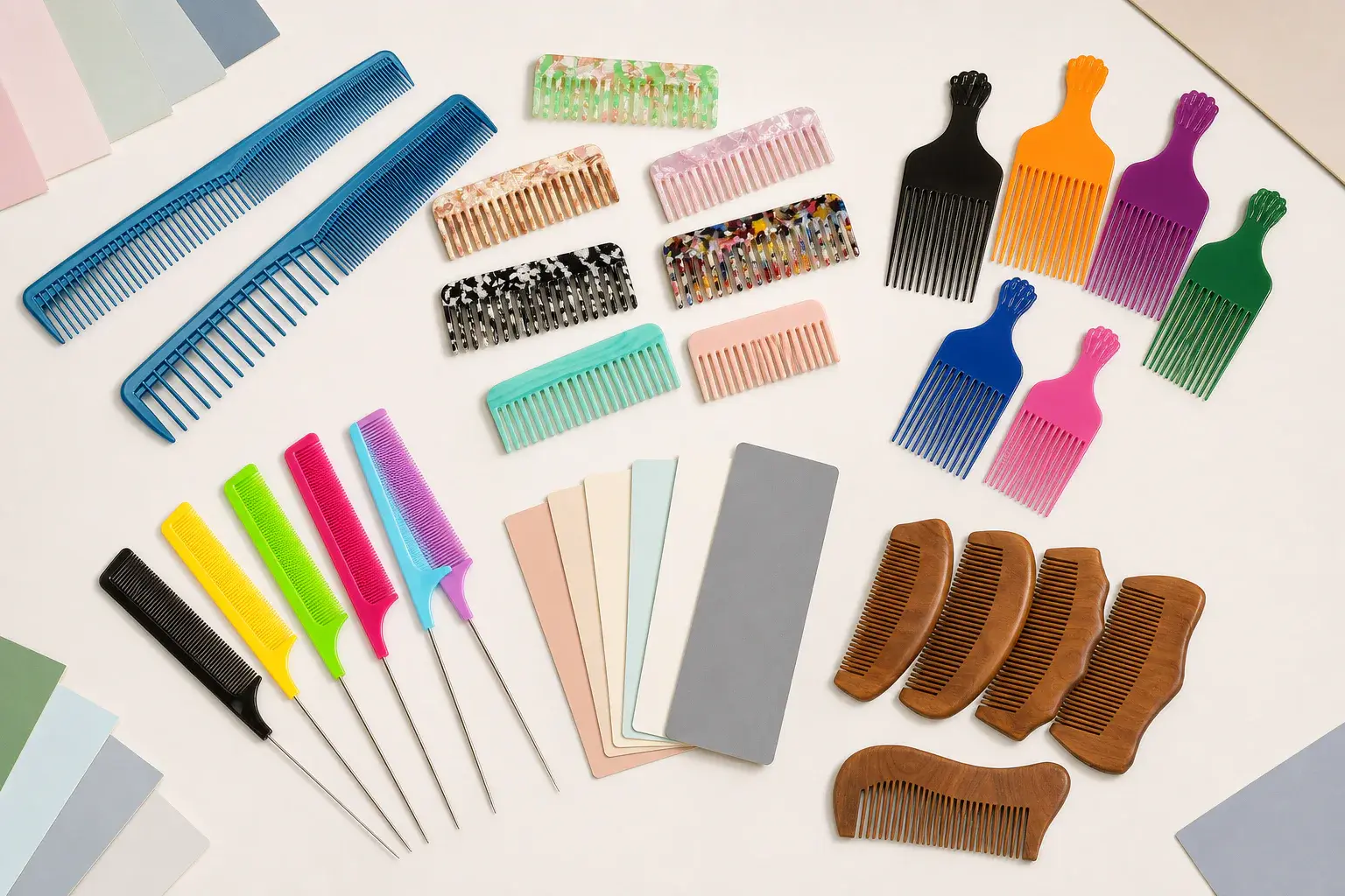
A Pantone code does one job well. It gives the buyer, designer and factory a shared color target. It does not show how that color will look in a glossy plastic comb, a translucent resin, a patterned acetate sheet or a piece of bamboo.
That difference explains many color disputes. A code may have been agreed at the start, yet the finished comb looks lighter at the teeth, darker along a thick spine or warmer beside the printed box. A useful custom comb color approval process connects the target to the actual material, shape and finish. The approved physical sample then becomes the reference that people can use during production.
Decide what the color target controls
Start by naming the part that the color reference applies to. It may control the molded comb body, a soft grip, a printed logo, a coating, a pouch, a paper box or several items in a coordinated range. Each part has its own material and production process, so one code cannot describe every visual result on its own.
A simple approval brief should connect every important color to a component. If the comb body and logo use different colors, give each one its own reference. If three comb sizes belong to one retail range, state whether they share one body color or have separate approved colors. This small piece of housekeeping prevents a color chosen for packaging artwork from being treated as the manufacturing standard for the product.
Choose the kind of color agreement
Color approval can mean several things. A solid molded comb may be developed toward a close physical match. A product and its paper package may only need to look coordinated. Natural wood, bamboo and patterned acetate usually need an accepted visual range because grain or pattern placement changes from part to part.
Write down which of these outcomes the project needs. A demand for identical appearance across plastic, ink, paper and wood is difficult to interpret because the surfaces reflect and absorb light differently. A coordinated family gives the reviewer room to judge the complete product. An accepted range gives natural and patterned material a clear boundary without pretending every piece will be uniform.
Treat screens as an early direction
A digital mockup is useful for choosing a direction and checking how colors sit together. Its appearance changes with the display, brightness, browser settings and the file used. It also cannot reproduce transparency, gloss, depth, grain or the way a curved comb catches light.
Use the screen to settle broad choices such as a muted green body with a cream logo. Move to a physical Pantone reference, material swatch, molded chip or product sample before final approval. When a buyer sends a photograph as inspiration, record what matters in that image. The useful instruction might be a warm grey direction, low gloss or a translucent finish.
Review solid molded plastic on the selected resin
For a solid injection molded comb, review the color on the selected plastic resin. The base resin, colorant, surface texture and gloss all affect the result. A polished surface can look deeper and more saturated than a matte surface made from a similar color mixture. Fine texture scatters light and can make the same direction feel softer.
Geometry also matters. A broad handle gives the eye a large field of color, while fine teeth create highlights and shadows. Review the handle, spine and tooth area together. If the resin, colorant source or finish changes after approval, ask whether a fresh sample is needed. The first signed sample only represents the conditions under which it was made.
Review transparent and translucent color at final thickness
Transparent and translucent combs need their own approval route. Their perceived color depends on how much material the viewer looks through and what sits behind the product. A thick spine can appear darker than a thin tooth even though both belong to one molded part. Overlapping features may add another band of color.
Review the sample at the intended thickness and with the intended finish. Look at it against a consistent background, then handle it as a customer would. Check the product in its package as well. A flat opaque swatch can guide the hue, though it cannot predict the depth of a transparent part.
Approve acetate as a sheet pattern and finished part
Cellulose acetate is commonly selected through a sheet color or pattern. Tortoiseshell, marble, pearl and confetti effects contain deliberate variation. Two combs cut from the same sheet can show different pattern placement, and the polished edge can reveal layers that are quiet on the face.
Approve the sheet direction, pattern scale and general color balance first. Then review a finished comb so you can see how the pattern lands on the real outline. If a brand needs a recognizable accent color within the pattern, say how prominent it should feel across the range. A single attractive sample is useful, yet the buyer also needs to understand the variation that may appear across other cuts from that sheet.
Approve natural material and finish together
Wood and bamboo begin with their own tone, grain and natural variation. Stain, oil, clear coating, sanding and engraving can change the final appearance. A stain reference viewed on paper says little about how it will behave on a particular material.
Review the chosen material and surface finish together. Ask for samples that show a realistic light to dark range when natural variation is expected. Look at engraved areas as well because exposed grain and burn tone can alter logo contrast. If uniform color is central to the brand concept, a coated or molded route may offer a more predictable visual direction than an exposed natural surface.
Compare samples under agreed viewing conditions
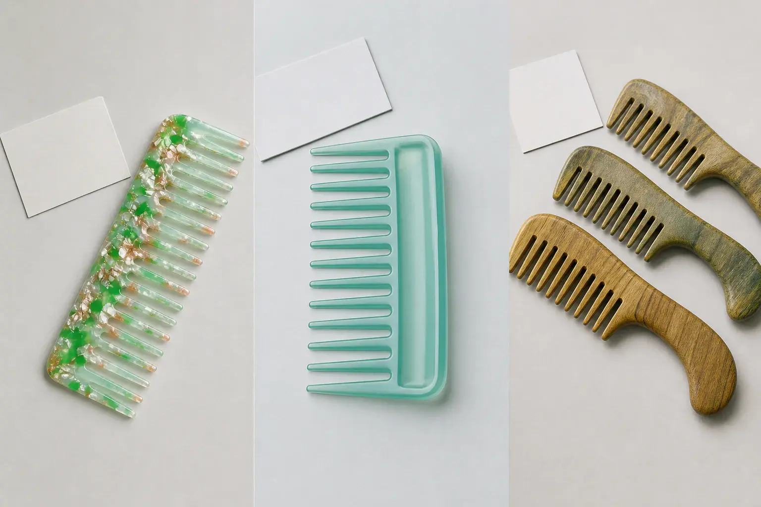
Place the target and sample beside each other. Review them under an agreed light source or in an agreed viewing location. Consistency matters because a color can feel warmer, cooler, brighter or duller as the light changes. If the product will be sold with a package, include that package in the review.
Keep the comparison practical. The buyer and factory should know which physical reference is being used, which face of the sample is important and how the decision was made. Some projects also require instrumental measurement. In that case, the device, color space, measurement geometry, sample preparation and acceptance range need to be agreed for that project. A generic number added after sampling will not resolve a poorly defined visual target.
Check the face, edges and working details
A quick glance at the main face can miss the area that customers notice. Turn the comb over. Compare the handle and spine. Look along polished edges and between the teeth. Open and close a folding design. Assemble any insert, grip or decorative piece that will be present on the finished product.
This is especially helpful for glossy, transparent, patterned and coated combs. Edges may look darker because the viewing path is thicker. A texture can lower apparent saturation. A joint can place two nominally matching materials together and expose a visible difference. Include these details in the approval decision.
Move through color approval in clear stages
Color references become more useful as they move closer to the final product. Keep the stages separate so an early directional choice is never mistaken for permission to begin bulk production.
| Approval stage | What it can show | What to record |
|---|---|---|
| Digital mockup | General color direction and layout | Artwork version and intended color references |
| Pantone chip or physical target | The color the project is aiming toward | Reference system, code or sample identity |
| Material chip or acetate sheet | Color, transparency, pattern and surface direction | Material, sheet reference, thickness and finish |
| Finished product sample | Color on real geometry with logo and finish | Sample identity, decision and approval conditions |
| Production reference | The standard used for order comparison | Signed sample or agreed range linked to the order |
The finished sample review is the point where color meets actual geometry, branding and finish. Once approved, identify that sample clearly and protect it from being mixed with rejected or earlier versions.
Review the comb, logo and package as one set
Color relationships often matter as much as a single color. A pale logo may disappear on translucent plastic. Fine printing can lose clarity against a busy acetate pattern. Laser engraving on wood creates a different kind of contrast from ink on a smooth molded body. Review the chosen logo process on the real material.
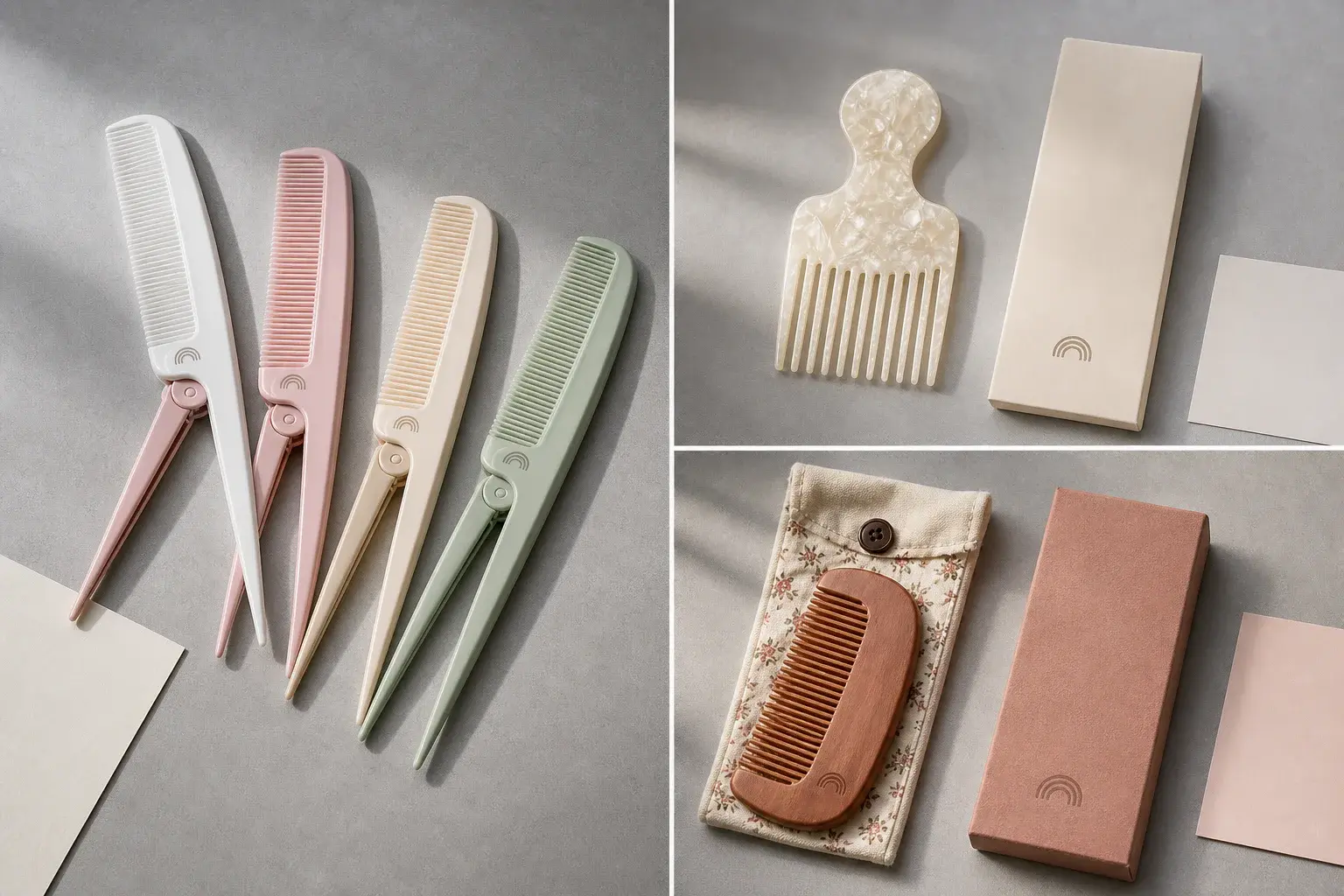
Place the comb beside its custom packaging. Decide whether the two should match closely or feel like a coordinated pair. Paper, fabric, plastic and printed ink respond differently to light, so a deliberate relationship is often more realistic than a promise of identical appearance. The sample set should show the actual hierarchy the customer will see when opening the pack.
Record the approved reference and range
A short color record can prevent long arguments later. Connect it to the product drawing, artwork and order. Include the material or sheet reference, color code or physical target, surface texture, gloss, transparency, coating and sample identity. Add the viewing condition and the date of the decision.
For natural and patterned materials, record the accepted range with representative samples where possible. Photographs can help explain pattern placement and obvious visual boundaries, though their appearance still varies by camera and screen. Keep them with the physical reference. If technical measurement is part of the agreement, record the complete method and the project specific acceptance range. Leave the field open until buyer and supplier have agreed it.
Carry color approval into production
Production checks should compare the order with the approved reference at the agreed stage. Keep references separated by product, material, finish and artwork version. A green comb made in matte plastic should not be judged against the glossy sample from another design simply because both began with the same Pantone direction.
Record changes that could affect appearance, including a new material batch, sheet, pigment source, coating or supplier. For a repeat custom comb order, confirm whether the original approved sample remains in suitable condition and still represents the current material route. If an important condition has changed, a fresh review may be the clearest way to protect consistency.
Prepare a color approval brief
A useful brief can fit on one page. Send it with the product drawing or specification and include the following information.
- The product, size and component that each color controls
- The Pantone code, physical sample or material swatch being used
- The selected material, thickness, texture and gloss direction
- Solid, transparent, translucent, patterned, stained or coated appearance
- The intended relationship between body, logo, secondary parts and package
- The physical sample stage required before production
- The accepted visual range or agreed measurement method when applicable
- The person responsible for approval and the decision record
This gives the factory enough context to propose the right sampling route. LuxoComb can review suitable custom color options against the chosen material and connect the signed sample to the wider custom comb project process.